Design matters now more than ever before. Because it’s all about your users. Your site needs to be attractive, easy to navigate, and nice to look at! You want users to be able to share input, and to communicate with one another. You want to promote “community.”
Here are three important ideas.

#1 Use White Space
 Sites of the past often tried to cram as much information as possible onto each page, but today we have evolved to appreciate the power of simplicity. White space adds significantly more to your site than just a sleek look. In addition to looking more clean and concise, having white space (or empty space) on your site naturally draws the eye to what’s most important (ie. illustrations, content, pictures, diagrams, etc.)
White space makes your site less overwhelming, allowing your content to be more legible and easier to digest. In addition to your content and visuals, having enough white space also helps your call-to-action or CTA stand out from the rest of the site, making your users more inclined to go through with your desired outcome. Other benefits of white space include creating balance and separating various features of your site.
#2 Provide Attractive Calls to Action
 If you want your users to perform a specific action at the end of their time on your site, your CTA should be designed to draw them in. Believe it or not, size matters when it comes to your CTA. Often times, a larger CTA button will command your user’s attention much more quickly than when they are smaller and more difficult to locate. Some designers even suggest you make it 20% larger than your logo. Remember to surround your CTA with plenty of white space to make it stand out even more.
In addition, make sure that it is placed both logically and effectively on the page so users want to click.
#3 Integrate Social Media
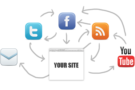
 Share what’s happening on your Facebook and other social media channels. Use “widgets” that are fun and attractive. Often, conversations start on your web. Other times they begin on social media. Let people go back and forth. Try to provide an almost “seamless” experience.
That’s a start. There’s more at the SpotIM blog.


0 Comments