Logo for the 400th anniversary of the Vincentian charism

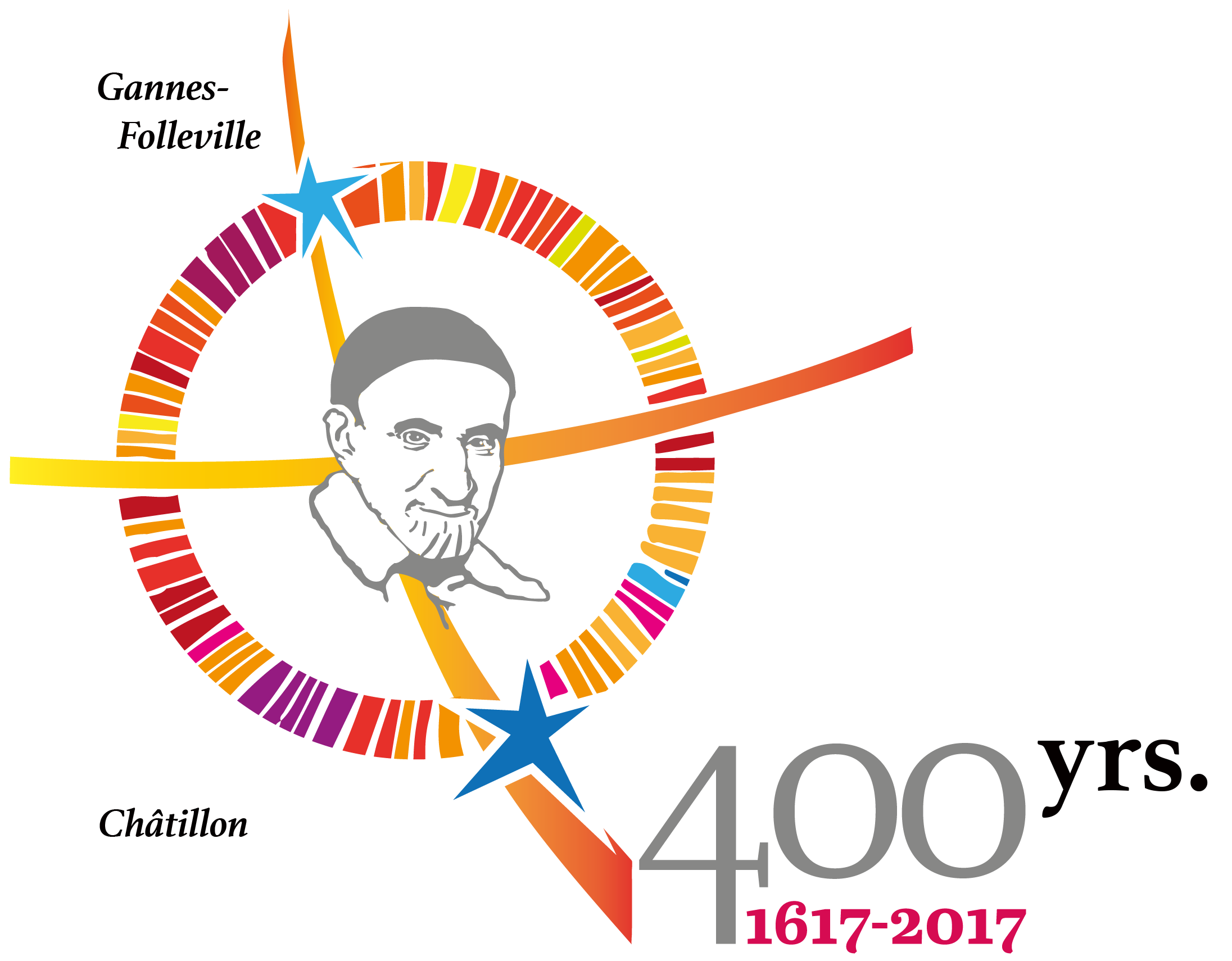
Fr. Alexis Cerquera Trujillo shares the logo he prepared for the 400 years of the Vincentian charism with us.
Explanation of the logo:
It is built from a basic figure: the circle … (the world, history, life, etc. …) This circle is formed by different lines that constitute rays in different colors (red, green, blue)…
These lines or rays symbolize the congregations, groups, associations founded within the Vincentian charism. They also symbolize society with its imperfections and joys, hopes and struggles…
This circle is a link between two stars that remind both “theological places” where Vincent de Paul saw the footprints of God in his life and through his words have become major events: Folleville and Châtillon.
The stars: Their placement reminds us of their location within French territory. They are linked by a cross of light that recalls the Resurrection and Pentecost.
The cross is always a sign of a new Spirit that inhabits us and invites us to live as Vincentian Family in our world, the reason for which the face of Vincent is located at the intersection of the cross.
Read the letter announcing the 400th anniversary year.
Download the Logo in English, French, Spanish, Polish, Portuguese and Italian by pressing the button below.
Tags: famvin400


0 Comments